Dashboards scale now for much larger datasets, Users can now create dashboard charts for clusters + 1 more
Dashboards scale now for much larger datasets
We're excited to share some great improvements our team rolled out this week. Here's what's new:
Dashboards just got a whole lot faster! Previously, large teamspaces with thousands of accounts experienced slower loading times—averaging around 4 seconds per dashboard. With the latest improvements, we've dramatically improved performance, reducing response times to less than 0.3 seconds. Your data is now quicker than ever at your fingertips!
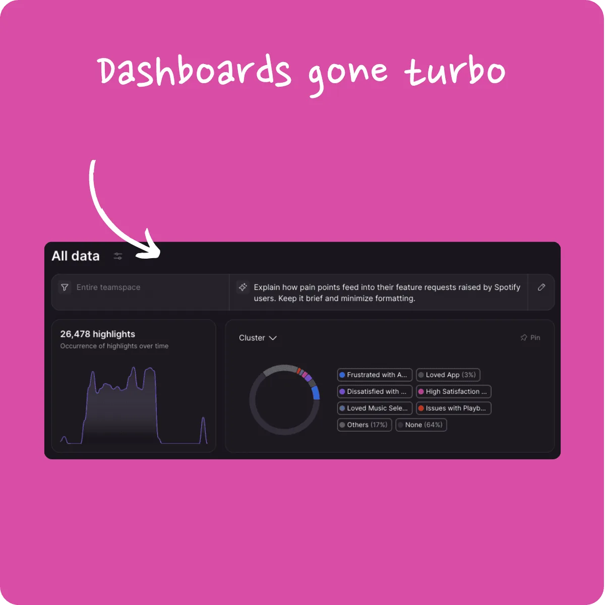
Users can now create dashboard charts for clusters 🎉
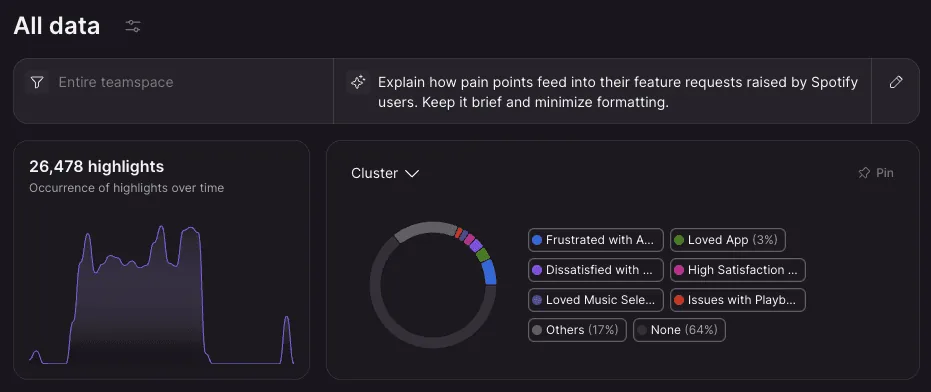
We're making dashboards even more powerful by adding a new chart option: Clusters. Now, you can instantly visualize highlights broken down by your customized clusters. It's perfect for teams using clusters as high-level themes, helping you quickly identify and understand patterns at a glance.
Easily view highlights not covered by dashboard pie charts 🎉
We've improved how dashboard pie charts display highlights without assigned tags. Instead of percentages—which didn't clearly represent overlapping tags—you'll now see the exact count of highlights. This makes it crystal clear exactly how many highlights aren't covered, ensuring your insights are always precise and actionable.

Stay tuned for more exciting updates next week!